


12 Reasons Why Bitcoin Will See Much Higher Prices In The Next Few Months

Welcome back.
After Bitcoin hit a new record of $67,000 earlier this week, it’s now back near $60,000. Bears have woken up and are now calling for another massive crash. I disagree. Below are 12 charts and 1 final big picture that show why we’ll be heading much higher. Bitcoin has just started revving its engine.
Ascending Triangle: Ever since the May crash, Bitcoin has been in this bullish pattern. We haven’t broken out of it yet, but I think we’ll soon see a weekly candle above the upper line.

Macro Uptrend: Bears were in charge during the summer. But Bitcoin has officially formed a higher low and higher high, meaning bulls are in charge. The trend is with the bulls now.

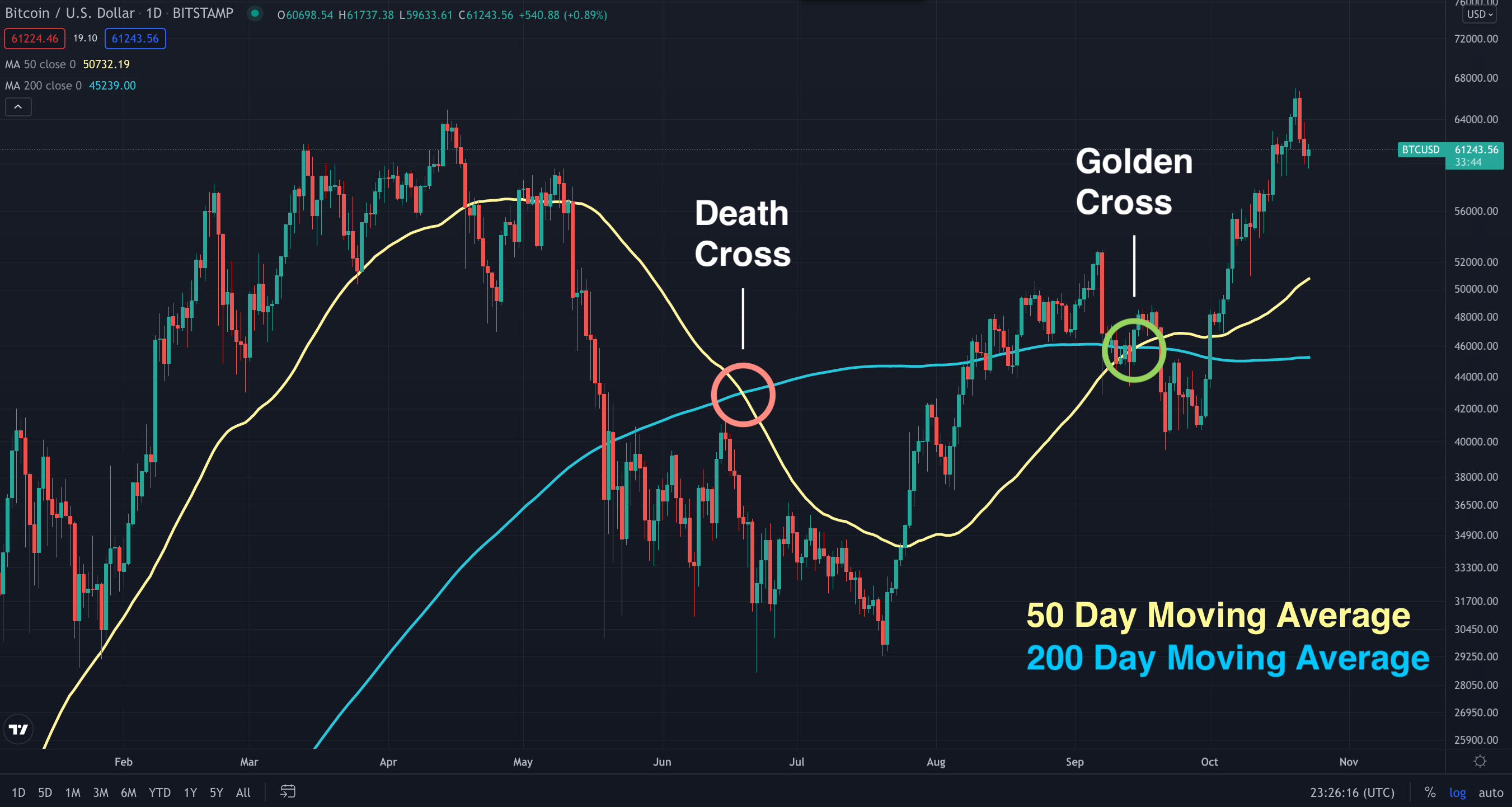
50 & 200 MA: We’ve above both Moving Averages. Death Cross in June was concerning but Golden Cross occurred just a few months later. 200 Day MA has flattened but I expect it to start climbing back up.
21 Weekly EMA: This is widely regarded as an important market indicator for Bitcoin. Above it, bull. Below, bear. We reclaimed it after the summer lull and are now in a better position.

Three White Soldiers: This pattern, which typically occurs at the end of a downtrend, is made of three large bullish candles, each closing higher than the last. The bulls are clearly in charge.

RSI: Every time Bitcoin went above 70 on the monthly time frame of the Relative Strength Index, it skyrocketed. We’re at 71.67 now. RSI is one of my favorite indicators and I’ll be watching it closely. The idea is to sell around 90.

MACD: Moving Average Convergence Divergence tracks the momentum of trends. The blue line was concerning during the summer but it reversed its direction. Bitcoin said, “I ain’t done yet.”

Stock to Flow: Halving is a coded event that happens roughly every four years. It basically reduces the supply of new Bitcoins. This model projects the price of Bitcoin based on its scarcity. We’re on track towards light green. (Credits to @100trillionUSD)

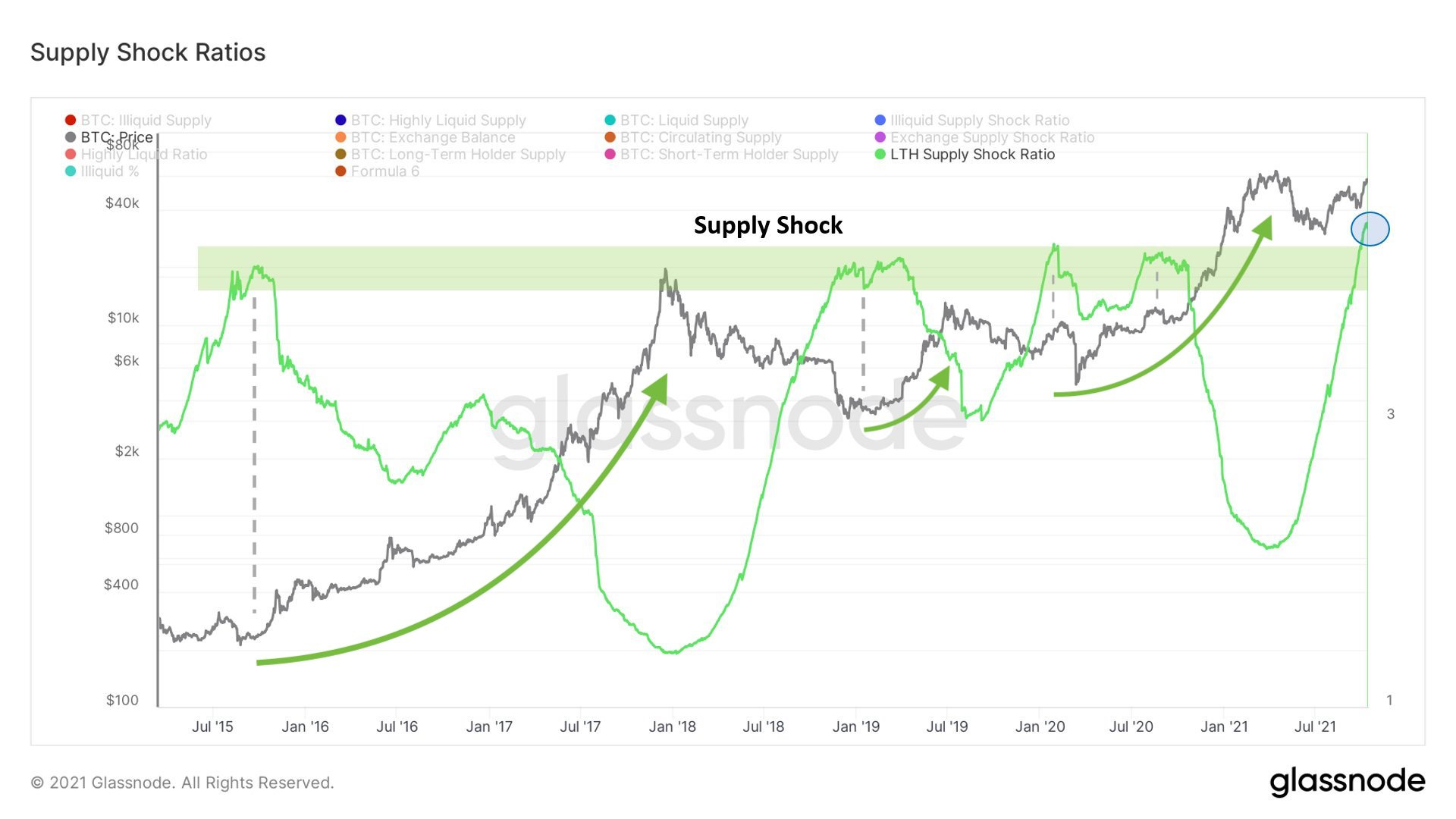
Supply Shock Ratio: This chart also speaks to scarcity. As more investors hold Bitcoin for the long term, there is less available. Meaning, it becomes more scarce and its price has to go up. The ratio is at the highest it’s ever been. (Credits to @WClementeIII)
All Exchanges Reserve: Whether you buy from Binance, Kraken, Coinbase or another exchange, this shows that the total amount of Bitcoins available for purchase is dropping. Increasing demand, decreasing supply. The outcome is clear.

Pi Cycle: This indicator uses moving averages to show whether the market is overheated or not. It predicted the first peak of this bull market cycle. Look out for the intersection of these two lines for the second peak. (Credits to @PositiveCrypto)

LGC: Logarithmic Growth Curve leans into the cyclical nature and volatility of Bitcoin to measure its price in the grand scheme of things. We just crossed the crucial midpoint and are about to enter the price discovery zone of the upper half. (Credits to @ColeGarnerXBT)
I hope that you walk away with new insights from these indicators and models to form your own plan. I believe we’re at the beginning of the 2nd leg of the bull market and this is where most profits and losses are made. Be careful, stay humble and don’t forget to take profits, my friends. I’ll leave you with one final picture. Food for thought.

Wow..! thank you for sharing all these amazing charts..!